10.30.2010

SATURDAY EVENING POSTER


Mondo Cane, 1964, by Zamecznik Wojciech.

MovieGoods.com is selling a $9.99 reproduction of this, but I'm not sure of the quality. Has anyone ever ordered a $9.99 11x17 reproduction from them?

10.27.2010

CHAPLIN PRINT


This 18x24" 2-color screenprint will be available at Nashville's Belcourt Theatre from October 30th thru December 5th or while supplies last. I need to thank the folks at Criterion and Janus Films, as this doubles as a teaser for some of the package art for the upcoming MODERN TIMES DVD and Blu-ray. If you're in Nashville, make sure to check out these brand new prints of these Chaplin classics -- visit the Belcourt's site for the full schedule!

10.25.2010

THE STORY OF HOUSE


A little over a year ago, Nashville's historic Belcourt Theatre treated a virgin midnight movie audience to the craziest movie they'd ever seen: Nobuhiko Obayashi's HOUSE. James Cathcart, a Belcourt staff member who was an important advocate in getting the film booked, had been hyping the movie up to me, and the Belcourt suggested I try designing a poster for it to sell at the screenings. I used the first idea that came to me after watching a screener of the film-- Blanche the cat's psycho-screaming mug-- and adapted it to stand alone as a symbol of the uncanny and over-the-top assault that our midnight movie audience was in for. One year, many more midnight screenings, and a nationwide theatrical tour later, HOUSE has arrived on DVD and Blu-ray, courtesy of Janus Films and the Criterion Collection.


Just after the Belcourt's hugely successful screenings, I came up with a game plan to try to impress the folks at Criterion (and encourage them to release the film) by designing 25 different HOUSE dvd covers. I didn't make it far with this plan (and thankfully it worked out), but I did have a little fun playing around with other ideas inspired by the film, like the above series of alternate posters as magazine covers. I also wanted to give Gorgeous, the film's protagonist, her own poster that matched the original and suggested a different tone, so I created this idea which ultimately ended up in a different form on the booklet cover:


Limited edition screenprints for the Belcourt's encore run of House,
in hot pink, electric blue and sour watermelon.

Getting the email from Janus Films that they wanted to use my poster for the nationwide tour of HOUSE was a dream come true. We worked out the upscaled design (I had designed the original Belcourt poster at only 12 x 18" and we we needed 27 x 40"), changed the text and the posters started going out with the prints. I immediately suggested the idea of doing a t-shirt too, just the cat face, which Eric Skillman put together for me. Months later, decals followed; Blanche had somehow become a miniature cult celebrity of her own. In those months, word of mouth was only getting stronger about this indescribably insane film, and Janus' newly-struck 35mm prints were a hot commodity. Somewhere along the line, a photo arrived in my inbox of Obayashi himself autographing one of the original Belcourt HOUSE posters. Marc Walkow, a mutual friend with Obayashi and Criterion and a producer on the DVD/BD release, kindly arranged for that poster to ultimately end up back in Nashville and it's now one of my most cherished possessions. If the story of HOUSE had ended there, it would have already been too good to be true.


When Criterion decided to induct Janus' Halloween goldmine into the pantheon of the collection, the cover had already been designed, but I was given the opportunity to have some fun with the rest of the package. I relished this chance to highlight the film's many, many gorgeous images that really don't get acknowledged often in reactions to HOUSE; for it is truly a beautiful film. I wanted to avoid any of the obvious images that get burned into your brain after watching HOUSE, and instead feature some less obvious (though nonetheless iconic) images that I've become so attached to as a massive fan of this film. With this approach I also didn't really have to worry about ruining any of the movie's best scares. There was plenty of great imagery to go around.


I also wanted to reframe the movie from the point of view of its characters-- specifically Auntie and Gorgeous-- and celebrate the great archetypal power of this story as Chuck Stephens (another Nashvillian on the HOUSE team) touches upon in his essay "The Housemaidens," contained in the booklet: "A coming-of-age story about a clique of teenage schoolgirls who will never grow old and a demon spirit in the guise of a spinster who was never young..." With a movie like HOUSE it's easy for reviewers and fans to harp on the genre elements and the film's overall craziness, but I've always felt that no one talks enough about how simply beautiful the film is, in both its aesthetic and its story. My approach to the booklet and overall package design for HOUSE was to counter that craziness (which the cover and poster, I think, do a decent enough job conveying on their own) with a tribute to HOUSE's beauty. I like to think that the package is one that would please this movie's biggest fans and most attentive students; the image on the Blu-ray disc, for example, is one that will probably only be recognizable to fans who have seen the film more than once. I also had fun designing the DVD menus:


What started as just another fun movie poster project became, rather quickly, a personal discovery of one of my favorite films. Seeing HOUSE with new midnight movie audiences, bringing new friends and family members to experience it for the first time, and now sharing it with even more people at home, this movie has grown so very dear to my heart. I'm so honored and grateful to have played even the smallest role in the story of HOUSE's North American release and success, and want to thank Toby, James and everyone else at the Belcourt, Mark Walkow, Sarah Finklea at Janus Films, Sarah Habibi at Criterion for getting in touch and really making my wildest dreams come true, and to everyone who was at all involved in bringing HOUSE to a whole new audiences in the United States this past year.

HOUSE is out today on Blu-ray and DVD from Criterion. Buy it, Netflix it, watch it, share it, tell everyone you know about it. Your life as a mortal moviegoer is about to change forever!


10.24.2010

10.20.2010

Process: KURONEKO


As Kaneto Shindo's amazing KURONEKO opens this Friday at Film Forum in New York City, I wanted to share a few rough concepts from my process of designing the theatrical poster for Janus Films.

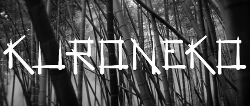
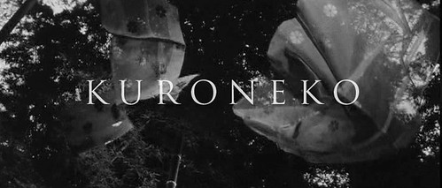
KURONEKO is a beautiful film, an erotic ghost story, full of amazing, haunting black and white images. The first thing I did was to try out some different title treatments against various backgrounds and patterns from the film. I saw a lot of potential in designing the title treatment around the film's visual motifs; straight, criss-crossed white lines to match Shindo's tall trees and bamboo, graceful white swoops and swaths to represent the mother ghost-cat somersaulting through the night air. I was also stuck on the idea of using a simple, elegant roman typeface that would really present the film as a classic ghost story.


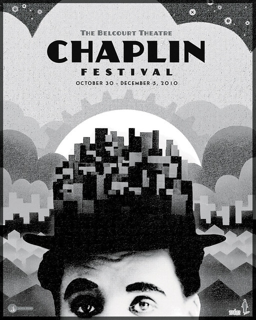
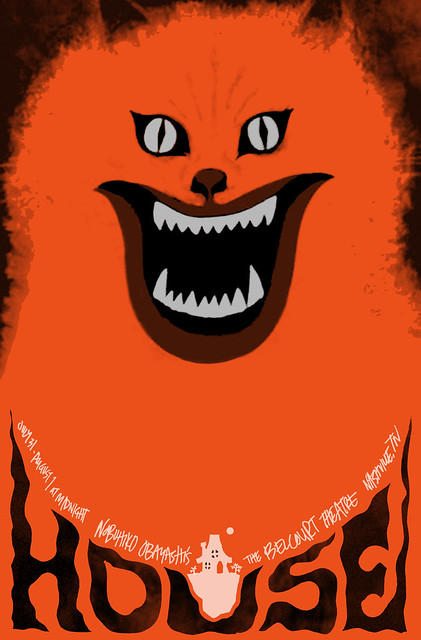
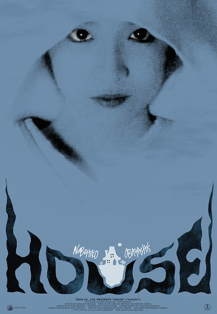
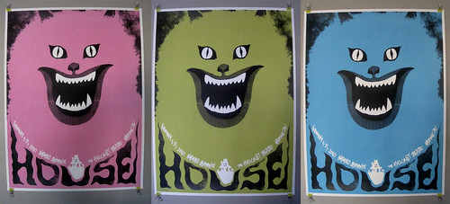
I then placed some of these title treatments in a few very rough designs to consider. Having done the HOUSE poster for Janus just recently-- another movie about a ghost cat-- we wanted to avoid any and all comparisons and make sure we kept the cat imagery to a subtle minimum. My first idea ended up more-or-less going all the way:


I really loved the characters in this film -- a murdered mother and stepdaughter who hunt samurai as ghost cats, and the mother's son who is haunted by their spirits-- and I tried to figure out a way to get all three characters (AND the cat) on the poster, with not much success. The closest I got was this image, one I really loved of the mother and son walking through the woods and the fog (both major visual motifs of the film), with the image of the stepdaughter superimposed:


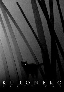
I thought these cat images were graphically interesting but ultimately not representative enough of the story (and also, the second one below was a little too close to the Broadway CATS poster):


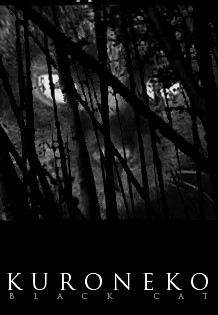
I liked this concept where we see through the forest gate into the spiritual realm of the kuroneko...


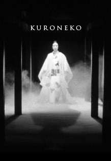
And this one of the mother, which almost made it to the next round:


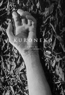
This one I had to try for fun... Makes for a cool teaser poster at least for the genre fans:


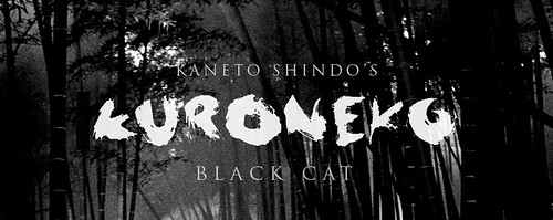
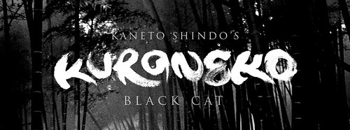
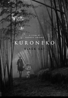
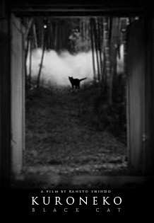
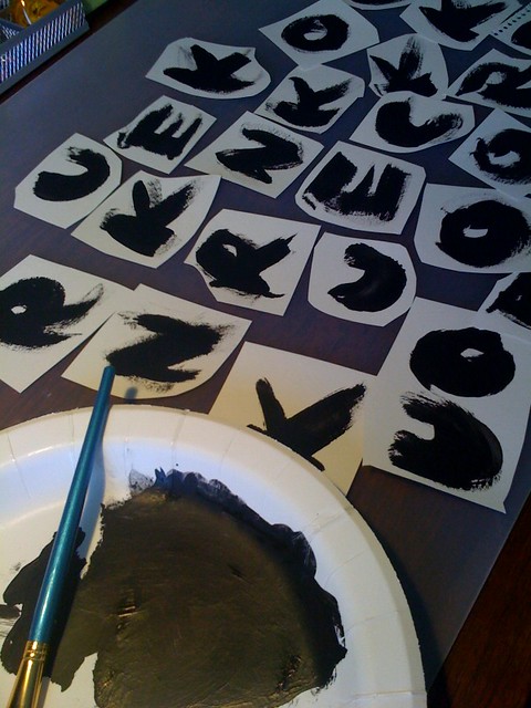
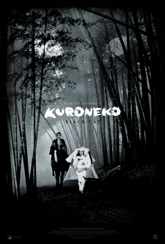
Our favorite direction among all of these was to use the image of the mother and son walking through the woods. It's not only one of my favorite images from the film, but it comes at a huge moment in the story. It's a mysterious image that is very evocative, but its meaning won't hit you until you arrive at this moment in the film. I tried laying in the cat eyes almost subliminally through the trees, and started setting in different title treatments. We ultimately decided to go with the broad paint-stroke lettering-- the elegant roman typeface wasn't quite spooky or Japanese enough (and I could use that in the credits/billing). So I got out the paints and started working on getting the letters just right:


I originally saw the title in the center of the poster, but it gave the overall design a chunky, kinda awkward look.


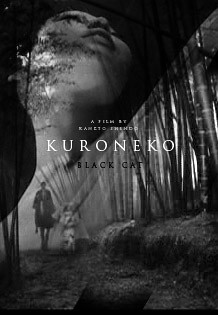
We put the title at the bottom of the poster and I gave it a little twist to match the landscape... then, with a little fine-tuning and a lot of computer magic to help the small figures and details read more clearly, we arrived at the final poster design below.


Hopefully our poster captures the ghostly tone and does justice to the film's beautiful imagery. KURONEKO is a stunning film, and I hope people check it out as Janus tours the new print around the country -- visit Janus Films for play dates and spread the word about this rediscovered Japanese classic.

10.18.2010

POLAND


POLAND magazine covers, courtesy of Jeremy Pettis. This was a magazine from the 60's and 70's that featured Polish writings, art, illustration and other various cultural articles. Visit his Flickr page for more of these and other great things.


10.09.2010

SATURDAY EVENING POSTER


Sorry for the lack of postings... been a busy week! More soon, but this week's poster comes from one of my favorite films of the year that I've just seen, Gaspar Noe's ENTER THE VOID. Designer unknown; IFC Films.

10.02.2010

SATURDAY EVENING POSTER


NORWEGIAN NINJA. Designer unknown. Played at Fantastic Fest but didn't get to catch it. I can only hope its as awesome as this poster.

10.01.2010

NEVER LET ME GO


Opening around the country right now is Mark Romanek's NEVER LET ME GO, one of the most profoundly beautiful movies I've seen recently. Because intelligent films for adults don't make money, Romanek himself sadly felt compelled to ask me to tell people about the film when I saw him present it to a lucky audience at Fantastic Fest, and that's what I'll be doing for the next couple of months. Starring Carey Mulligan, Kiera Knightley and Andrew Garfield, three of the most brilliant actors of their generation, and based on the beloved novel by Kazuo Ishiguro. It is a film about being alive, about the time we're given as human beings. Too often films like this slip through the cracks, in regards to how much money they make and how much attention they get from critics and awards groups; say what you will about the Academy, but any deserved nominations this film might get would only increase the amount of people that would be able to see it. If you have the opportunity, please do see it, and thereby make your own small pledge in support of well-made films for adults-- or even teenagers, who I'd imagine would respond very strongly to this film-- finding some success.